
Sep 29, 2024
7 min read
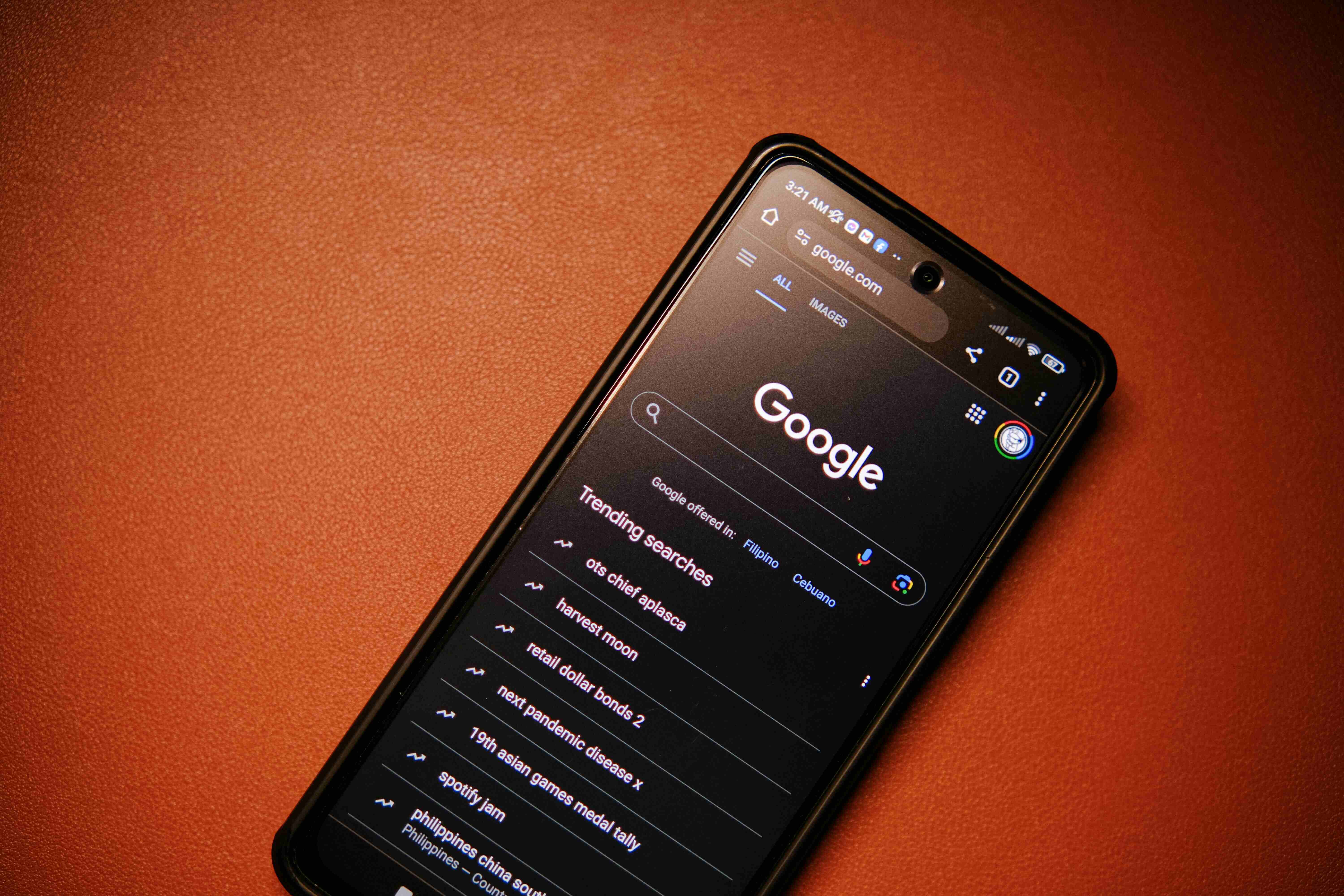
Dark Mode in UX Design: When and Why to Use It
Dark mode has surged in popularity, becoming a staple feature in apps, websites, and operating systems. This design trend, characterized by light text on dark backgrounds, is more than just an aesthetic choice—it offers practical benefits for user experience, including improved readability, reduced eye strain, and better battery life. But when should you use dark mode, and how does it impact the overall UX? Let’s dive into its growing role and why it matters for design.
Why Dark Mode is Popular
The shift to dark mode isn't just about looking cool—there are several reasons for its rising popularity:
Reduced Eye Strain: Dark mode is easier on the eyes, especially in low-light environments. Staring at a bright screen in dim conditions can cause discomfort, and dark mode helps mitigate this by reducing the contrast between the screen and surrounding space.
Energy Efficiency: On OLED and AMOLED screens, dark mode can significantly improve battery life. Dark pixels consume less power, which makes it a practical choice for mobile devices where battery life is a priority.
Modern Aesthetic: Dark mode has a sleek, contemporary feel that users enjoy. It also provides a more focused visual experience by highlighting content without the distraction of bright backgrounds.
User Preference: Many users simply prefer dark mode, often switching between light and dark themes based on the time of day or their environment.
When to Use Dark Mode
While dark mode has clear benefits, it’s not always the right choice for every design. Here’s when to consider implementing it:
Low-Light Environments: If your app or website is likely to be used at night or in dark environments, dark mode can enhance readability and comfort for users.
Content-Heavy Platforms: Dark mode works particularly well in platforms that present a lot of visual or media-heavy content, like video streaming apps or design tools. It draws attention to content while reducing glare.
Customization and User Control: Offering dark mode as an option gives users more control over their experience. Users who prefer it can switch based on their needs, whether it’s for visual comfort or battery savings.
Battery-Dependent Apps: Apps where power efficiency is critical—such as navigation, fitness tracking, or gaming apps—can benefit from dark mode’s battery-saving properties, especially on OLED devices.
Impact on Accessibility and Readability
One of the key challenges of dark mode is ensuring accessibility. While dark mode can reduce eye strain, it may also create readability issues if not designed carefully. Here are a few factors to consider:
Contrast: Too little contrast between the text and the background can make content hard to read. Ensure there’s enough contrast to maintain readability without causing eye strain.
Color Choices: Some colors don’t display well on dark backgrounds, leading to poor visibility. It's important to choose colors that maintain sufficient contrast and don’t blend into the background.
For Users with Visual Impairments: Dark mode isn’t ideal for everyone. Some users, particularly those with certain visual impairments like astigmatism, may find light text on dark backgrounds harder to read. Offering a toggle between dark and light modes ensures that users can choose what works best for them.
Benefits Beyond Visual Comfort
Dark mode offers more than just visual comfort and aesthetic appeal:
Battery Life Extension: On devices with OLED or AMOLED screens, dark mode can extend battery life. These displays don’t illuminate dark pixels, meaning that apps with predominantly black backgrounds consume less power.
Focus on Content: Dark mode shifts the focus to the content, making it stand out. In media-heavy apps, such as photo editors or video platforms, the content feels more immersive with a dark background.
Conclusion
Dark mode is more than a passing trend in UX design—it offers tangible benefits in terms of user comfort, energy efficiency, and personalization. However, it’s important to implement dark mode thoughtfully. Ensuring strong contrast, careful color selection, and offering users a choice between light and dark themes can make a big difference in how well it improves the overall user experience.
By balancing both functionality and aesthetics, dark mode can enhance digital products, making them more usable, customizable, and visually appealing across diverse environments.